My name is Alex, a passionate generalist designer based in Edinburgh, UK. Driven by a love for intuitive experiences, I've transitioned from my roots in graphic design and print to crafting engaging digital worlds. Now, I focus my magic on UI/UX, weaving seamless interactions, 3D and motion design to bring ideas to life.
Over the years, I’ve worked on countless websites, applications and digital assets. Some are alive, others are lost forever, hence why I decided to focus this portfolio on only four (five, if you count the portfolio itself) recent projects I had tremendous fun and freedom working on.
The project involved the redesign of an existing website with the primary objective of creating a brand new, visually appealing, and modern look. The aim was to enhance the website's overall aesthetic and functionality, making it more engaging and captivating for the customers of Residence.
One of the key focuses of the redesign was to showcase the services in a more accessible and straightforward manner. The layout was carefully planned to ensure that important information about the services was prominently displayed, making it easy for visitors to quickly understand and evaluate what Residency had to offer.
The mobile version of the website was carefully crafted to adapt to different screen sizes, maintaining the same visual appeal and functionality as its desktop counterpart. By utilizing responsive design techniques, the layout and content dynamically adjusted to fit various mobile devices, such as smartphones and tablets, without compromising the overall user experience.
We extensively experimented with numerous prototypes to streamline the development process, prioritizing simplicity and ease of use. This involved incorporating a diverse range of elements, a selection of which is showcased here. When it came to typography, we diligently followed the website's style guide, particularly adhering to the Sarina style.
I am currently working on the redesign of the Satigo website, with the goal of enhancing user experience, updating its overall look, and ensuring alignment with the brand identity of Satigo. My dedication lies in delivering a visually appealing and user-friendly online platform for Satigo, Residence, and Nine.
However, since the redesign is still ongoing, I am unable to provide specific details or additional information at this time.
The website is currently undergoing development with a primary focus on transitioning to a single-page layout that incorporates all the existing pages. This approach is designed to enhance the user experience by providing a unified and seamless view of the website's content in one place.
By consolidating all the information and functionalities from various pages onto a single page, we aim to simplify navigation and reduce the need for users to switch between different sections of the website. This streamlined approach ensures that visitors can easily access all the relevant information without any unnecessary clicks or page loads.
YEAR
2022
DURATION
5 weeks,
18 hours per week
TOOLS USED
Figma
Illustrator
Photoshop
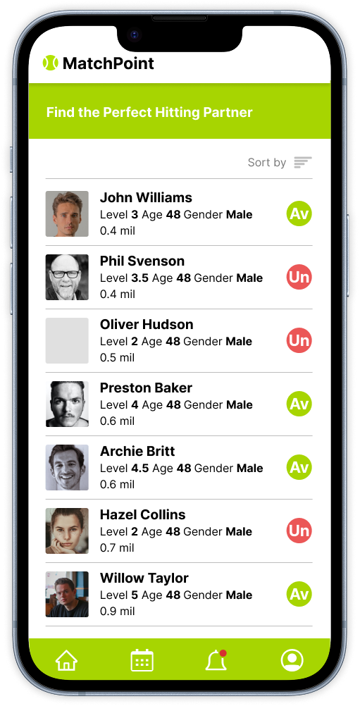
A social app for tennis fanatics based in Edinburgh, but with global ambitions. It breaks barriers and connects players depending on location, skill level and availability.
Project goals:
1. To help people find in-door/outdoor tennis courts nearby
2. To connect players so they could arrange a game whenever and wherever convenient
My Role:
Research > Mapping > Wireframing > Architecture Interaction > Prototype
The idea was born out of frustration stemmed from difficulties between me and friends finding suitable times and places to play tennis. As someone who’s moved around alot, (but with tennis aspirations always remaining in one place), I’ve always found it tricky connecting with new players on a similar level as me and finding suitable locations. This then led to conducting a survey with other tennis amateurs in my area and MatchPoint came to be.
There isn't much competition, but the one that does exist is all-encompassing as far as interests and activities are concerned, so I thought there’s definitely place for something more focussed and niche.
This took a while but as a natural progression in the app development after sketch-stage, I ended up quite pleased with the overall look and navigation of the app.
Any designer’s ultimate goal is to create something incredibly intuitive, powerful and seamless. This is what makes us tick and has always pushed me to explore new systems of execution.
I've stuck to making the app as easy to use as possible and I really believe it's made for a smooth user interface.
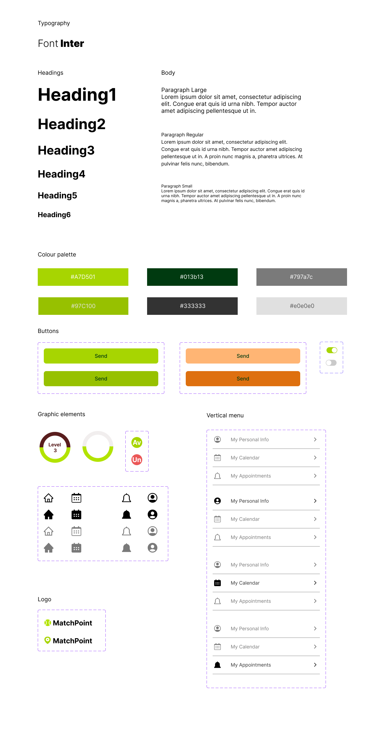
It was important to choose a typeface that's created specifically for screen and Inter turned out to be a perfect match(point).
As far as the colour palette is concerned, less is always more in my opinion.
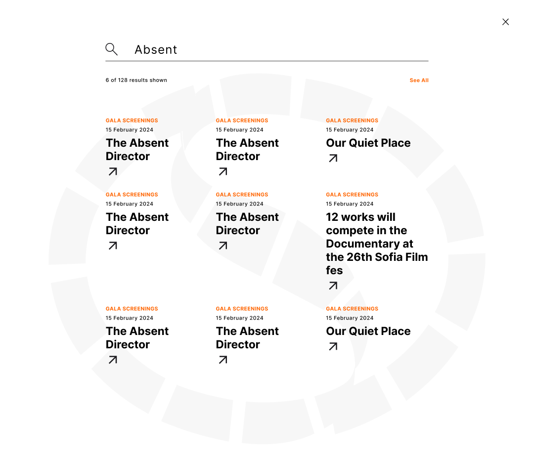
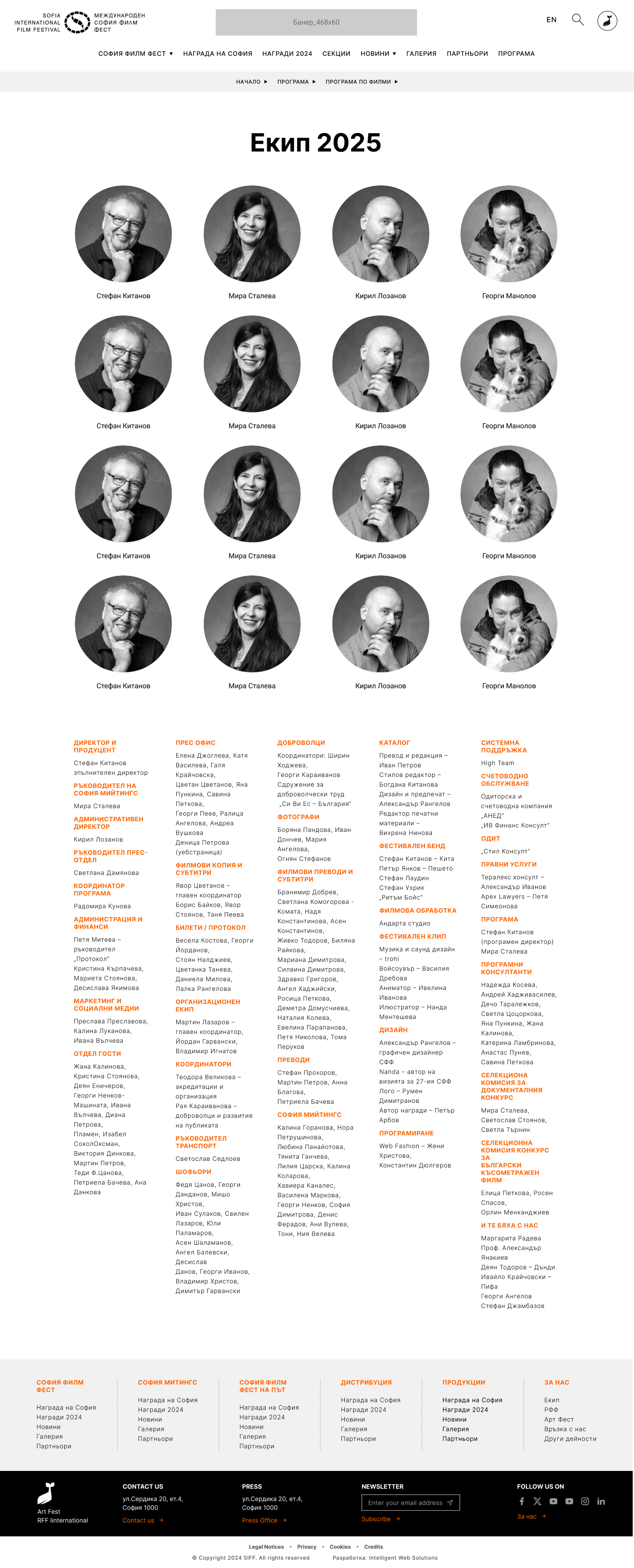
The Sofia Film Festival is the largest film festival in Bulgaria and sought to establish a robust online presence that reflects its expansive nature and global perspective. Our aim was to create an authoritative website design capable of accommodating a substantial amount of information, while maintaining a clean and user-friendly appearance.
For a project as heavy and complicated as this, the most important challenge was to establish a hierarchy of all required elements.
Every edition of the festival has a selection of titles it’s leading with and it was decided that the site’s structure should be based around them.
The look of each movie page consists of a full synopsis and the details of all cast and crew involved. There’s also a video and image gallery, delivered in a light and accessible way.
News and events are brought together, with an easy system to sort them by, as the user toggles over each section.
The primary goal was to collect a substantial amount of information during the festival, capitalising on the presence of a large audience within a limited timeframe. However, due to the disorderly nature of the festival's organisation, conducting a survey proved to be excessively challenging.
We conducted an extensive review of numerous international websites that share similarities in size and scope.
We managed to gather in the office and developed a set of 17 questions, formatted them into an A4 sheet and stationed ourselves with a table in front of every cinema where a screening took place. Half an hour before each screening, we approached the viewers and requested them to take a moment to fill out the survey. Naturally, a significant portion of the surveys ended up in the bin. Nevertheless, we were pleased to discover that approximately 20% of the surveys were completed, which was quite satisfying.
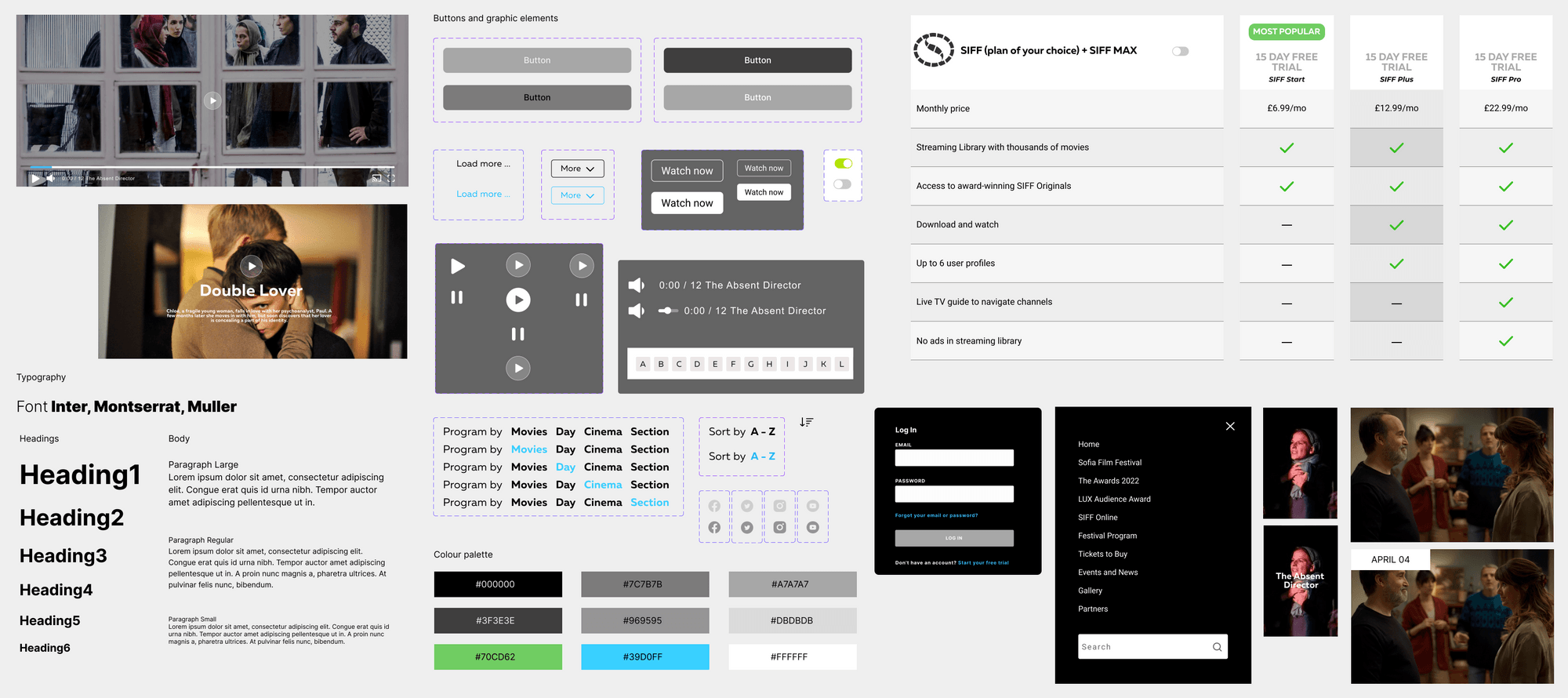
The festival required two programmes to be developed – one for the schedule, with the option to purchase tickets for the cinema, and another for the films from the festival over the years with a registration form and seating plan.
The programmes needed a sorting system to allow viewing each title by different parameters such as name, screening location and sections.
The plan selection is still in development as it’s connected to the festival’s continuous negotiations with various streaming companies.
Over 10 years ago, I designed the film festival’s website and to me it seems it’s stood the test of time with its simplicity, but we still decided to take things a step further.
Each year, the festival commissions a design studio to develop a new identity, so it was important for me to develop neutral and flexible brand guidelines to avoid any clashes with future visuals.
We are continuously testing the website to make sure it’s legible, intuitive and performs equally well on each platform.
As the mobile view is still in development, we are unable to show the prototype just yet but you can scroll up and down to get a quick glimpse.